
HomeTownLocator.com COVID-19 Data Tools
HTL Data Tools make it easy to interact, sort and search with COVID-19 data
MALABAR, Fla. (PRWEB)
April 25, 2020
HomeTownLocator.com (HTL) has provided maps and demographic information about cities, towns, counties, states and ZIP Codes to over a million visitors a month since 2005. They have a very popular series of tools to compare, contrast and rank different geographic units. Now, courtesy of a data feed from The New York Times, HTL has added state and county COVID-19 data to the mix.
SEARCHABLE, SORTABLE AND LINKED DATA
It’s useful to see a spreadsheet or chart of data. One can study the data for a while and see what information can be learned from it.
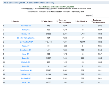
However, it’s powerful when you can interact with the data by, for example, taking a table of every county in the U.S. that has reported one or more cases of COVID-19 and presenting it in an interactive table with four columns (Total Cases, Cases per 100,000 people, Total Deaths, Deaths per 100,000 people).
As of 4/22/2020, that table contained 2,824 counties, 834,677 COVID-19 cases and 42,515 COVID-19 deaths.
Working with an interactive table with 2,834 rows is not difficult when you simply display 20 rows per page. You can sort the data by any of the four columns with one-click for an ascending sort (lowest to highest), or two-clicks for a descending sort (highest to lowest). Each sort takes less than a second.
Want to see the 100 counties with the highest per-capita number of deaths (deaths per 100,000 people)? Simply click twice on the correct column and the 100 counties with highest per capita death rates will be in ranked order on the first five pages in less than a second.
Want to jump to the data for particular county? Simply start typing in the search box and as you type each letter, the list of possible counties will shrink until you find the one you are looking for.
There are functionally identical tables for working with all the states, as well as each individual state and its counties.
One useful advantage of working with COVID-19 data in HomeTownLocator.com is that the data is linked in such a way that it is very easy to find additional information about a specific community whenever you want to learn more about that location.
For example, if you’re reviewing a list of the top twenty counties in the nation based a descending sort on deaths per 100,000 people, than Randolph, GA may catch your attention since it had the highest per-capita death rate on 4/22/202 with 213.5 per 100,000 people. When you click the link for Randolph County, GA, you’re taken to COVID-19 page with bar charts for daily reports of new cases and deaths for that county (148 as of 4/22/2020).
The COVID-19 page is now part of a standard HTL County Profile that includes demographic data, boundary maps, ZIP Codes, physical, cultural and historic features and schools. There are links within the County Profile that link to Community Profiles for incorporated cities, towns, and villages as well as Census Designated Places.
ABOUT HomeTownLocator.com
The HomeTownLocator® series of state gazetteers, produced by HTL, Inc., has been a popular online resource for local information for over 14 years. In the last 12 months, the site has received over 16 million visits according to directly measured data by QuantCast.com.
Share article on social media or email: